
What is Atlassian Design System (ADS)
The Atlassian Design System (ADS) is powerful and comprehensive. It organizes content clearly. It helps designers and developers quickly find the needed components, styles, and guidelines.
This clear hierarchy makes the design system easy to use. It helps with large teams or complex projects.
The Evolution and Versions
The ADS began in 2002, when Atlassian was founded. Early products like JIRA and Confluence quickly gained market recognition.
ADS has developed a well-established system. It includes accessibility and responsive layout features. It has grown from basic design components. Each update shows Atlassian’s effort to improve user experience.
Understanding ADS’s changes helps designers use it better and see future design trends. You can deeply appreciate each version's charm through the evolving Jira interface.
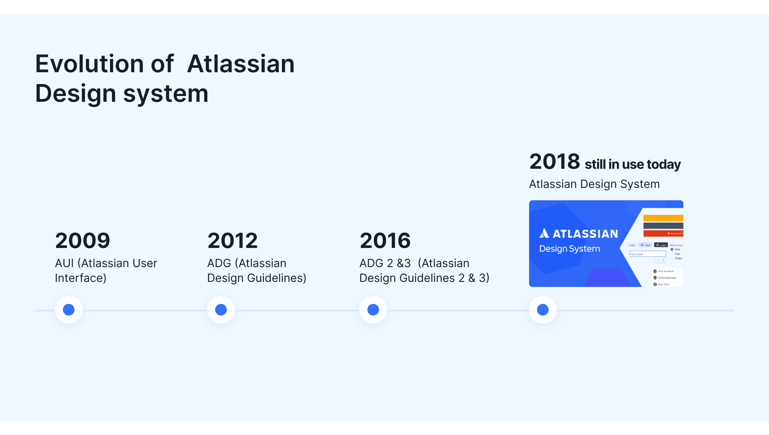
AUI (Atlassian User Interface) 2009
AUI was Atlassian's first design system. It provided UI components and styles for products like Jira and Confluence.
It uses jQuery. It provides basic UI components, like buttons and dialogs.
The design was basic. It lacked a unified style. It focused more on functionality and consistency.
ADG (Atlassian Design Guidelines) 2012
ADG was a further development of AUI. It aimed to unify the visual style and user experience across Atlassian products.
It introduced clearer design guidelines, standardizing aspects such as color, typography, and icons.
The goal of ADG was to make all Atlassian products look and feel the same, creating a better user experience.
ADG 2 &3 (Atlassian Design Guidelines 2 & 3) 2016
ADG 2 was a major upgrade of ADG. It used responsive design to adapt to different devices and screen sizes. This fixed scalability issues.
ADG3/Atlaskit provided flexible building blocks, allowing developers to reuse components across multiple products, speeding up the development process. Jeniffer, who contributed to the creation of ADG3, shared insights about the process.
Atlassian Design System(ADS)2018
The ADS is the latest design system from Atlassian, integrating content and code from the Atlassian.design and atlaskit.atlassian.com websites. It fully incorporates prior design experience with modern design principles.
It has a full library of UI components, icons, colors, and design rules for all Atlassian products.
The system strongly emphasizes ease of access. Supporting multilingual and international design needs.
It stresses integration with modern frontend frameworks, like React. This boosts development efficiency and component reuse.
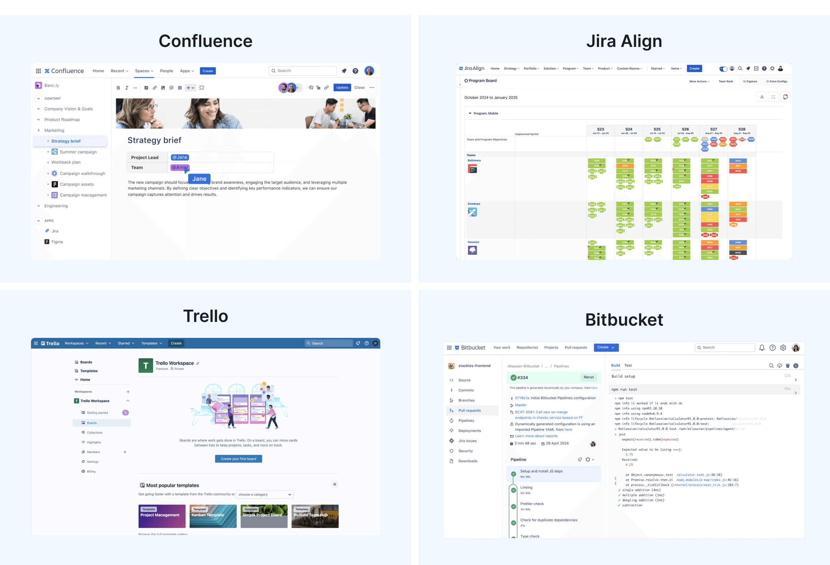
What Products Built with ADS
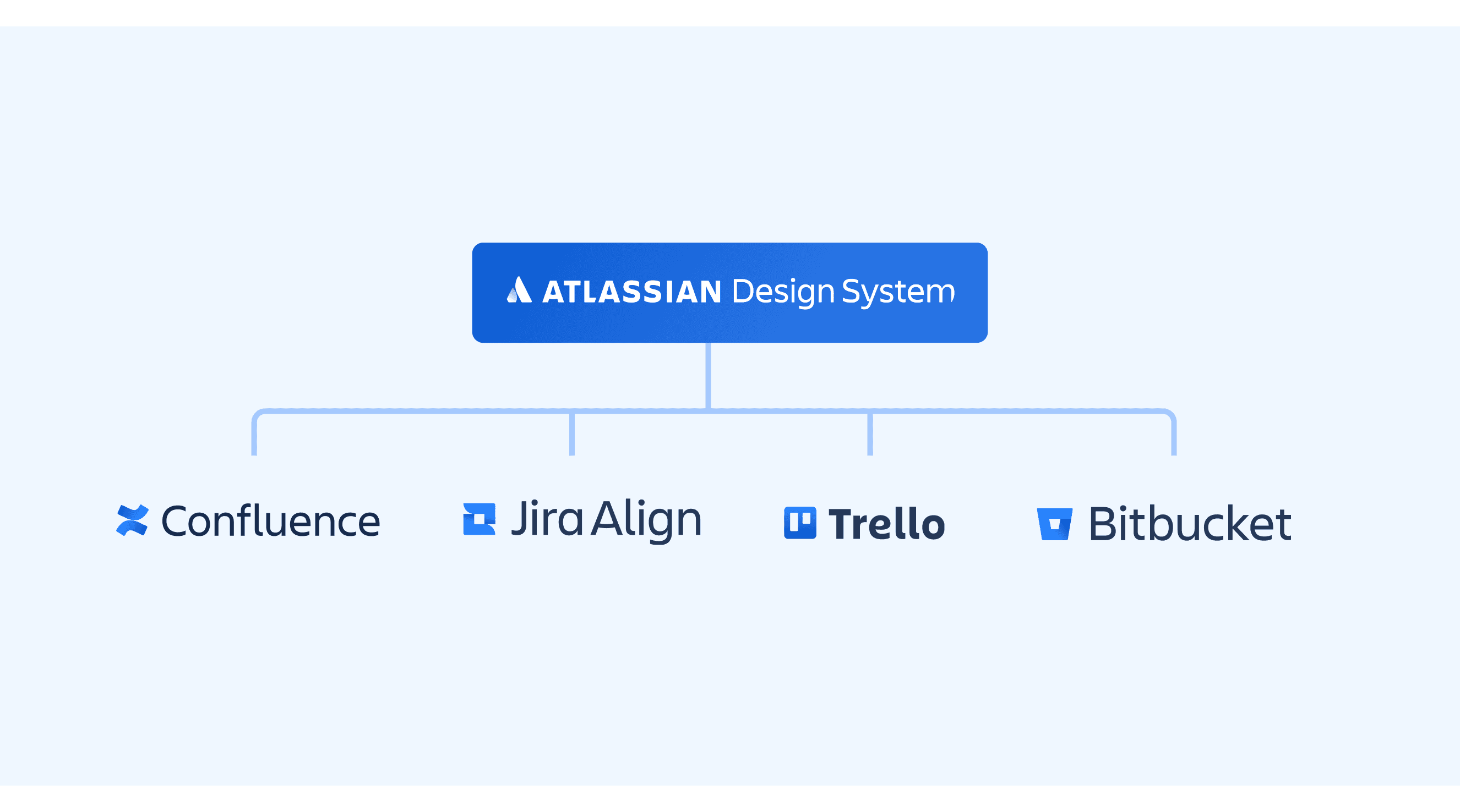
Confluence: Team collaboration and content management platform.
JIRA: Tool for managing projects and tracking issues.
Trello: Task management and collaboration tool.
Bitbucket: Code management and collaboration platform.
And more 18+ Atlassian Products.
Applicable industries for reference
Material Design highlights visual feedback and imitates the physical world. In contrast, the Carbon Design System focuses on consistency. This makes it perfect for large-scale enterprise applications. IIn contrast, the ADS optimizes the user experience for team collaboration tools, especially in complex project management and collaboration environments, such as:
Enterprise Applications: They need complex features and high consistency. Examples are project management tools and CRM systems.
Collaboration Platforms: Tools that support team collaboration and information sharing, such as knowledge management systems and social networks.
Productivity Tools: Apps that boost individual and team productivity. They include task management and time tracking tools.
Platform Support and Use Cases of the Atlassian Design System
Supported Platforms
The Atlassian Design System (ADS) supports multi-platform and multilingual development, ensuring a consistent user experience.
Web Platform: ADS works with React, Angular, and Vue. It supports HTML and CSS, making it perfect for many projects. The typography in the Atlassian Design System has a clear hierarchy. This enhances text readability.
Mobile Platform: On iOS and Android, developers can use Swift, Objective-C, Kotlin, or Java. They can change UI components to fit ADS design.
Cross-Platform: ADS also supports cross-platform frameworks like Flutter and React Native, ensuring consistency across multiple devices.
Use Case Scenarios
A Guide and Template to Atlassian Design System
Style Template File for Motiff

Effective Use of the Color system
The Atlassian Design System’s color system uses saturated, neutral, and alpha colors to add meaning and enhance UI elements. It relies on design tokens for consistent color use across products, covering different roles, emphasis levels, and interaction states.
The system follows WCAG AA contrast standards for accessibility and supports both light and dark themes, offering specific color mappings for each mode to maintain a cohesive user experience.
The use of color in data visualization is crucial. Best practices include
ensuring enough color contrast to improve readability.
limiting the number of colors to avoid overly complex charts.
maintaining a consistent color palette to help users quickly identify data.
Choose colors that match cultural meanings to avoid confusion. Utilize palettes suitable for the color-blind.
These strategies are easy to understand. They enhance the user experience.
Typography Hierarchy and Readability
The Atlassian Design System has a well-organized typography system. It makes text easy to read and scan.
The system offers various font weights and sizes for headings and body text. It uses a base scale for visual rhythm and consistency. The typefaces enhance readability and user experience, ensuring readability on all devices.
Icon Design Principles
The Atlassian Design System's icons are minimalist and geometric. Atlassian designs the icons to be easy to identify. They must communicate meaning without text.
The typography system in the Atlassian Design System has a clear structure. This helps make the text easy to read and scan.
ADS Components Templates

A-D
E-G
H-L
M-P
R-Z
App provider
Atlassian navigation
Avatar
Avatar group
Badge
Banner
Blanket
Breadcrumbs
Button
Calendar
Checkbox
Code
Comment
Date time picker
Drawer
Dropdown menu
Dynamic table
Empty state
Flag
Focus ring
Form
Heading
Icon
Icon object
Image
Inline dialog
Inline edit
Inline message
Layout grid
Link
Logo
Lozenge
Menu
Modal dialog
Onboarding (spotlight)
Page
Page header
Page layout
Pagination
Popup
Progress bar
Progress indicator
Progress tracker
Radio
Range
Section message
Select
Side navigation
Spinner
Table tree
Tabs
Tag
Tag group
Textarea
Text field
Toggle
Tooltip
Visually hidden
Accessibility in the Atlassian Design System
The Atlassian Design System emphasizes the importance of accessibility. It advocates for early planning to ensure accessibility. It should address visual, auditory, mobility, and cognitive impairments. It should also use inclusive language.
The system recommends using text alternatives to enhance the use of assistive technologies. It also suggests using high-contrast colors for better readability. And, give users control over interface personalization. Atlassian encourages using semantic HTML to enhance navigation and understanding.
Atlassian advocates for inclusive language to honor diversity. It suggests thorough testing with users of varying backgrounds and skills. These principles enhance ease of access and comply with WCAG standards.
Other Resources
Atlassian Color Palettes: It lists brand colors, neutrals, and functional colors. It includes hex codes, RGBA values, or dark mode mappings for consistency.
Atlassian Github : Provides resources, code access, and collaboration opportunities for developers.