
What is Material Design?
Material Design (MD) is a design language created by Google. It helps apps and websites look the same on different devices and platforms. It uses familiar visuals, simple rules, and motion effects. This makes design better, saves time, and makes using apps easier.
Many designers use MD because it is in many popular apps and follows good design rules. Over 6,943 companies use MD3 in different industries. It also helps developers work together better. It has depth, flexibility, simplicity, and support from a large community.
The Evolution and Versions
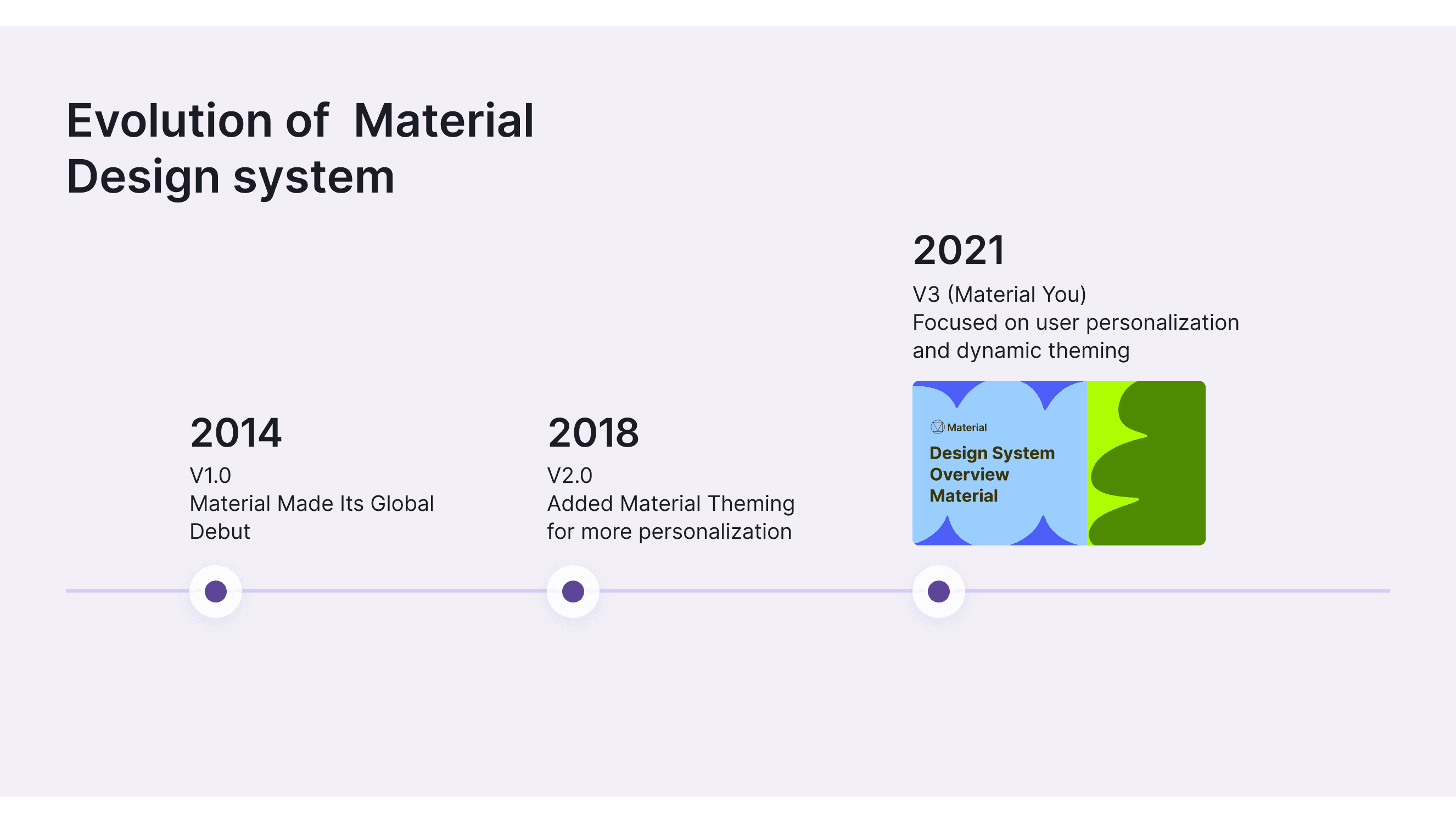
MD started in 2014 to make all Google products look and feel the same. Each new version allows more customization options and makes apps think unique.
Looking back at the past decade of Google Design’s development, it has evolved significantly, with each new version allowing more customization options and making apps feel unique. Google works with partners worldwide to meet the needs of designers and developers. MD is used everywhere, shaping design practices and improving user interactions.
Material Design 1.0 (2014)
Material Made Its Global Debut. Introduced to unify design across Google products and third-party apps. jhttps://design.google/library/when-material-made-its-global-debut
Flat design with layers and shadows.
Bold colors, typography, and consistent icons.
Meaningful motion and responsive design.
Added Material Theming for more personalization while keeping core principles. Launch of coded components
Material theming for brand customization.
Flexible changes in color, typography, and shapes.
Emphasis on expression and flexibility.
Material Design 3 (Material You) (2021)
Focused on user personalization and dynamic theming.
Dynamic color theming based on user preferences.
Customized UI elements like rounded shapes and new animations.
It improved accessibility and user control over appearance.
These versions show how Material Design has become more flexible and focused on user needs.
What Products Built with Material Design 3

Google Calendar: A calendar app for managing and syncing personal or team schedules.
Google Drive: A cloud storage service for storing and sharing files, accessible across devices.
Gmail: Google’s email service offers a fast, secure emailing experience.
Google Photos: A photo storage and management app that supports automatic backup and intelligent categorization.
Google Keep: A note-taking app for quickly jotting down notes, voice memos, and managing to-do lists.
YouTube Music: A music streaming service providing personalized music recommendations and playlists.
Google Contacts: A contact management tool for organizing personal and professional contacts.
Google News: A news aggregation platform that offers personalized news recommendations based on user interests
Applicable industries for reference

MD3 is popular because it creates a simple and easy-to-use interface.
Technology and Software: Creates easy-to-use software.
E-commerce and Retail: Improve how users shop online.
Finance and Fintech: Makes banking apps more evident.
Healthcare: Enhances health app experiences.
Education and E-learning: Builds engaging learning tools.
Media and Entertainment: Standardizes streaming app designs.
Transportation and Travel: Simplifies travel app navigation.
Real Estate: Organizes property search apps.
Government Services: Provides consistent experiences in public apps.
Platform Compatibility and Use Cases of the Material Design 3
Supported Platforms
MD3 works on many platforms. It provides a consistent experience:
Web Platform: Works with React, Angular, and Vue. Compatible with HTML and CSS.
Android: Built-in MD.
iOS: Allows custom elements with Material Components.
Cross-Platform: Supports Flutter and React Native for consistent UI on both Android and iOS.
Use Case Scenarios
A Guide to MD3

Open and use Material 3 in Motiff
Effective Use of the Color System
MD3 uses dynamic colors to make apps look different based on user choices. This makes the experience more personal and engaging.
Dynamic Color matches the user’s system theme or wallpaper, creating a unique experience.
For example, Android 12 uses Material You’s dynamic color to adjust apps based on the user’s wallpaper.
Material 3 Dynamic Colors Feature in Android Studio with Jetpack Compose!
Typography Hierarchy and Readability
Material 3 Typography Guidelines focuses on straightforward typography to guide users and enhance their experience:
Hierarchy: Use different text styles (headlines, subtitles, body) to make reading content easier.
Contrast: Ensure strong contrast between text and background for better legibility.
Spacing: Apply proper line height and spacing to improve readability.
Google Fonts provides an open-source and widely used font library for Material Design. For example, Roboto and Noto are strongly recommended fonts in the Material Design guidelines, and both are available for free from Google Fonts.
Icon Design Principles
Material 3 Icon Design principles aim for simplicity and consistency:
Simplicity: Use minimal details for clarity at all sizes.
Consistency: Maintain a uniform style across all icons.
Alignment: Align icons to keyline shapes like squares and circles.
Readability: Ensure icons are evident, even at small sizes.
Color and Contrast: Use color to enhance recognition and meet accessibility standards.
Material Design 3 ( You) Components

Open and use Material 3 in Motiff
MD3 components improve the user experience by adapting to user preferences. They use rounded shapes and dynamic colors.
For example, elevated buttons provide clear feedback. And navigation bars that match app themes.
Actions
Communication
Containment
Navigation
Selection
Text inputs
Accessibility in Material Design (MD 3)
Material 3 Color Contrast Guideline focuses on accessibility. It follows the WCAG and best practices for inclusive, user-friendly experiences. Key elements include color contrast, structure, flow, and elements. Ensures all users can access content easily:
Color Contrast: It keeps a high contrast between text and background colors. This ensures all elements are readable.
Structure: Focuses on creating a logical and hierarchical structure to improve navigability. Clear headings and layouts help users find information.
Flow: It creates a clear, predictable flow in the UI. It guides users smoothly through the content. Simple and predictable navigation guides users.
Elements: Use accessible components like buttons, text fields, and sliders. They must have the right size, spacing, and interactive states.
Other Resources
Material You Blog: Updates and case studies in real projects. It covers the latest trends and best practices.
design.google: Google’s official platform for designers to meet the people and processes behind the products.
Material Components for the Web: A set of reusable, ready-to-use components for web apps. They follow MD 3's guidelines for a cohesive, accessible experience.
Browse Material Icons: A set of icons made with MD 3. They ensure visual consistency and accessibility across platforms.
Visit Material Design on GitHub: It has open-source resources, code samples, and libraries. They help developers implement MD 3 in their projects.