
What is Carbon Design System?
Carbon is IBM’s open-source design system for products and digital experiences. With the IBM Design Language as its foundation, the system consists of working code, design tools and resources, human interface guidelines, and a vibrant community of contributors.
The Evolution and Versions
The Carbon Design System, developed by IBM, has come a long way from version 6 to version 11. Each update has aimed to make the system more accessible, improve theming options, update components, and refine token names. The latest major update, Carbon v11, introduced features like light and dark mode support and better integration with CSS grids while staying true to the IBM Design Language. And now, version 12 is on the way.
Carbon v6 (2015):
Built with IBM Design Language v1.
Pre-built assets, design tools, human interface guidelines, and a community of contributors.
Carbon v7 - v8 (2017):
Laid the foundation for a cohesive design language across IBM’s digital products.
Provided a unified framework for designers and developers.
Introduced initial design guidelines, color palettes, and typography standards.
Significant visual and structural overhaul to align with the updated IBM Design Language.
Introduction of a 2x grid system to enhance layout consistency and flexibility.
Updates assets to IDL v2.
Updates grid to 16 columns.
Adds Carbon Elements package.
Includes updates to token and prop naming for easier usage.
Adds support for light and dark mode.
No major brand updates or product redesigns required.
What Products Built with Carbon

IBM.com Commerce Platform: The checkout process was switched to Carbon to enhance the product experience and boost conversion rates.
IBM Cloud: This is a comprehensive suite of cloud computing solutions that includes Infrastructure as a Service (IaaS), Platform as a Service (PaaS), and Software as a Service (SaaS).
IBM Watson: IBM's well-known artificial intelligence platform offers a variety of AI services and applications, such as natural language processing and machine learning.
IBM Data and AI: A range of tools and solutions designed to help organizations manage, analyze, and gain insights from their data.
IBM Security: Including IBM QRadar, IBM Security Identity Governance, and other security products, utilizing Carbon to achieve a unified security management experience.
And more than 5+ IBM Products.
Applicable industries for reference
Website design: The Carbon Design System is used to create unified product experiences for IBM software products.
Information Technology and Services: Ensures cohesive and standardized interfaces for various IT tools and services.
Healthcare and Life Sciences: Enhances usability and data visualization in medical applications.
Finance and Banking: Creates secure, accessible, and user-friendly financial services interfaces.
Retail and E-commerce: Provides a seamless and intuitive shopping experience across platforms.
Manufacturing: Standardizes industrial automation and supply chain management interfaces.
Telecommunications: Improves customer service and network management tool interfaces.
Platform Support and Use Cases of the Carbon Design System
Supported Platforms
The Carbon Design System is built to provide a consistent experience across multiple platforms.
Carbon supports React as the primary framework
It also works with Web Components.
Community-contributed components are available for Angular, Vue, Svelte, and Vanilla JS, making it highly flexible for various web development projects.
Use Case Scenarios

A Guide and Template to Carbon Design System
Style Template File for Motiff
Open and edit Carbon Design System V11 Template in Motiff.
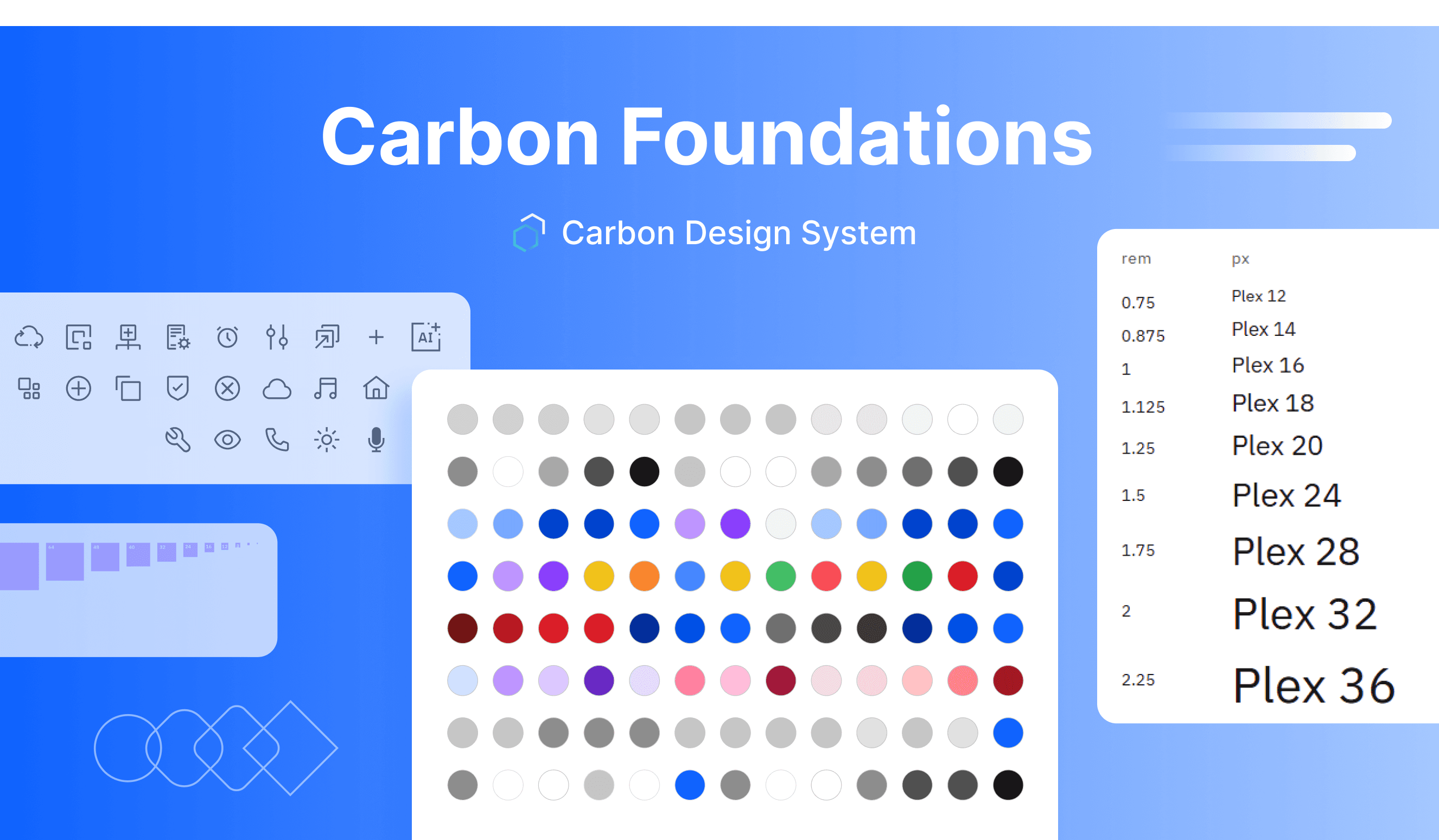
Effective Use of the Color System
Using a consistent color palette brings a unified look to IBM’s digital products and interfaces. This consistency is based on well-defined rules for working with the Carbon component library in both dark and light themes.
The Carbon Design System uses a token-based color approach to ensure a consistent and accessible visual experience. Color tokens standardize how colors are used across all themes, making modifications easy and maintaining visual consistency. Carbon also emphasizes accessibility by maintaining high contrast ratios, which support users with visual impairments. This approach ensures that your interface is not only visually appealing but also inclusive.
Typography Hierarchy and Readability
Carbon uses type tokens to define the typography. A type token is a pre-set style with typographic elements such as font size, weight, and line height. The typography is calibrated for use with the open-source IBM Plex typeface.
Carbon defines typographies for two situations. Productive typography for product and web designs. The Expressive typography for web, graphic, and print usage extends the Productive design with more dynamic typographic hierarchies and more variety with a fluid Heading scale. The typography is designed to be highly readable and accessible.
Icon Design Principles
Carbon Icon Design Principles ensure consistency and proper representation of the IBM brand:
Unique and Non-Redundant: Ensure your icon is unique and not already in the Carbon library.
IBM Design Style: Follow the IBM Design Language. Keep icons consistent with the overall visual style.
Accessibility: Icons must meet IBM's accessibility standards. They should be usable by everyone, including those with visual impairments.
Cross-Platform: Icons should work well on all supported platforms and devices. They must scale correctly and remain clear at different sizes.
Global Understanding: Icons should be easy to understand worldwide. Avoid culturally specific symbols that might confuse users from different backgrounds.
Carbon Components Templates

Open and edit Carbon Design System V11 Template in Motiff
All of the components in Carbon have been designed to work harmoniously together, as parts of a greater whole.
In addition to the main components from IBM, there are extra components available in the Community assets. These are made by the Carbon community and offer more tools and features for your projects.
A-D
E-L
M-P
R-Z
Accessibility in the Carbon Design System
Accessible design benefits everyone, not just users with disabilities. An accessible product should give all users the same quality of experience and adapt to different users and situations.
Carbon components follow the IBM Accessibility Checklist, which is based on WCAG AA, Section 508, and European standards. The Carbon team ensures patterns are perceivable, operable, and understandable for all users, including those using screen readers or other assistive technology.
Building accessible products involves using individually accessible elements and components.
Other Resources
Github-Carbon-design-system: The page includes code, documentation, and resources for using Carbon in projects.
Carbon UI Builder: Carbon UI Builder is a visual tool that allows users to assemble product pages and layout modules using Carbon Components in a fraction of the time it usually takes.
Gatsby theme Carbon site: A pre-built Gatsby theme that utilizes the design elements and styles from the Carbon Design System.