
What is the Ant Design System?
Ant Design (AntD), developed by Alibaba, is the second most popular React UI design system globally(GitHub Forks: 48.9K, Stars: 91.9K), The first one is material design(GitHub Forks: 32.1.K, Stars: 92.4K).
Ant Design is known for offering a complete set of tools. These tools help developers build consistent and user-friendly interfaces for web applications. Ant Design is widely used in enterprise-level applications due to its scalability, flexibility, and rich functionality.
One of its best features is internationalization. It supports over 50 languages, making it great for projects aimed at global audiences. This system ensures that key UI elements like forms, notifications, and date pickers are localized to match the user’s language preferences.
As an open-source project, Ant Design continues to grow with contributions from the developer community. Its popularity comes from its easy-to-use, customizable parts. It also simplifies the design and development of responsive, scalable applications.This version includes important improvements.
Evolution and Version
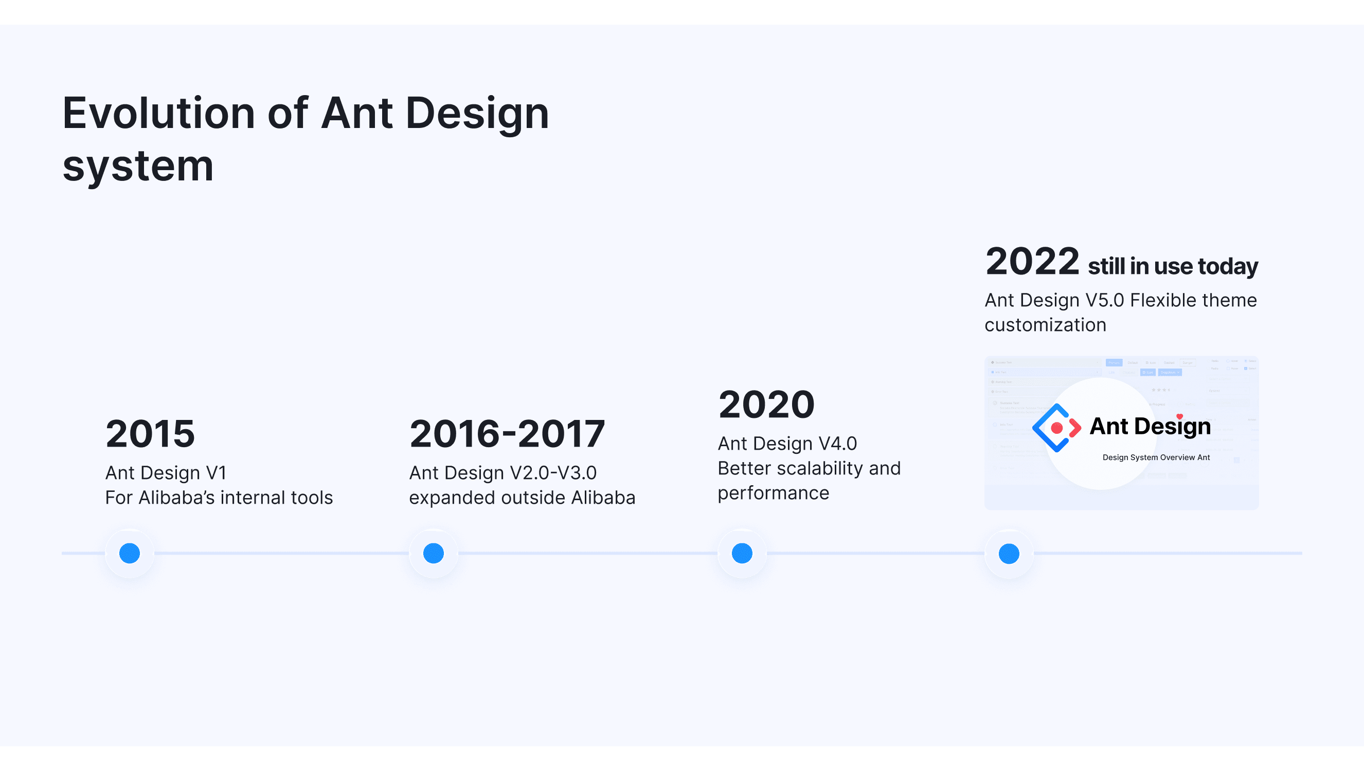
Ant Design is frequently updated to meet the evolving needs of developers and designers. Over the years, several key versions have been introduced, each solving specific problems and improving the design system:
This version aimed to standardize design for Alibaba’s internal tools.
Provided basic UI components for desktop apps.
Focused on consistent design across projects.
Ant Design V2.0 (2016) and V3.0 (2017)
As Ant Design expanded outside Alibaba, flexibility and mobile support became important.
Improved customization and added data visualization tools.
Enhanced mobile responsiveness and support for global projects.
With large-scale projects using Ant Design, the focus shifted to better scalability and performance.
Improved interaction design and accessibility.
Enhanced layouts for large projects.
Components Optimization and dark theme.
More details about Ant Design 4.0 updates.
Ant Design V5.0 (2022)
This version brought several key improvements, each aimed at enhancing flexibility, performance, and usability, Modernized Ant Design for complex web apps. AntD has provided detailed information about this update on their official website.
Added dynamic themes and responsive design improvements.
Expanded the component library for easier development and design. Adds FloatButton for navigation and Tour to help guide users through app features.
Replaces Moment.js with Day.js for faster performance and removes support for Internet Explorer 11.
Ant Design continues to evolve to meet the changing needs of developers and designers.
What Products Built with Ant Design System
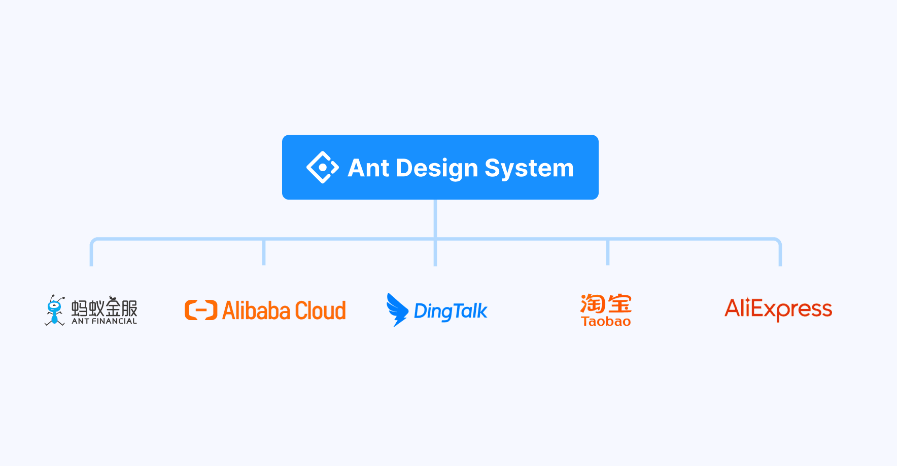
Many well-known products and platforms have been built using Ant Design due to its strong focus on enterprise-level applications and user experience. Ant Design is used by many companies, both within Ant Group and beyond, to create strong and user-focused web applications. Some of Ant Group Products include:
Alibaba: As the creator of Ant Design, Alibaba uses it in many of its platforms. It helps build efficient, well-designed web applications. Like Taobao, Alibaba Cloud.
Ant Financial: A large financial company, Ant Financial uses Ant Design to make apps that are easy for users to navigate. like Alipay.
Dingtalk: This is a business communication tool made by Alibaba. Dingtalk uses Ant Design to offer a smooth and simple user experience.
Xianyu: A marketplace by Alibaba, Xianyu uses Ant Design to create a consistent and easy shopping experience.
Ant Design is trusted by many companies to build modern websites. Besides the well-known examples, more than 1,056 other companies use Ant Design, including Autohaus Royal GmbH, Malfini, Olympus Corporation. This shows how useful and reliable it is for creating simple, scalable, and user-friendly digital products across different industries.
Applicable industries for reference
Ant Design is a flexible UI design language and React component library, ideal for enterprise-level applications. Here are some industries where it’s commonly used:
Finance: Platforms like OceanBase Cloud Platform provide cloud services for financial institutions, helping with digital transformation.
Cloud Computing & Big Data: Alibaba Cloud StreamCompute uses Ant Design for real-time big data processing and analysis.
Enterprise Applications: Ant Design Pro enhances efficiency in designing and developing enterprise back-office systems.
E-commerce: Ant Design supports e-commerce platforms by building systems for categories, products, inventory, orders, and more.
Data Visualization:AntV integrates with Ant Design to create rich, interactive data displays.
Knowledge Management: Yuque, a document collaboration platform, uses Ant Design to facilitate teamwork.
Development Workbench: Umi UI streamlines local development processes, improving project efficiency.
For more industry examples, visit the Ant Design case studies.
Platform Support and Use Cases of the Ant Design System
Supported Platforms
Ant Design supports a range of platforms, making it flexible and easy to use. Below are the platforms it works with:
Web: Ant Design is built for web applications, providing many useful components for front-end and back-end design.
Mobile: Ant Design supports mobile-friendly designs with responsive components that work smoothly across different devices.
Cross-browser Compatibility: Ant Design is fully compatible with major web browsers, ensuring a consistent experience across different platforms.
React: As a React-based design system, Ant Design is perfect for developers using React to build dynamic and interactive websites.
AntV Integration: Ant Design works with AntV to create interactive and rich data visualizations, ideal for projects with a lot of data.
Use Case Scenario

A Guide to Ant Design System

Effective Use of the Color System
Ant Design’s color system is split into two levels: the system-level and product-level color systems.
The system-level colors provide a consistent set of core colors, including 12 primary colors and their variations. These colors are used for important elements like backgrounds, borders, and functional components such as buttons and alerts.
The product-level color system allows for more flexibility. It lets designers adjust colors to match specific product needs while keeping the overall design consistent with Ant Design’s guidelines. This balance between flexibility and consistency helps create unique designs that still follow the core principles.
For more details, visit the Ant Design color documentation.
Typography Hierarchy and Readability
Ant Design’s font system focuses on readability and clear hierarchy. It uses a base font size of 14px for optimal readability across devices, with appropriate line height to ensure spacing is comfortable. The system employs regular (400) and medium (500) font weights, reserving bold (600) for emphasis. This structure helps guide users through content, making key information stand out.
The typography hierarchy ensures headings, body text, and secondary details are easily distinguishable, helping users navigate content effectively.
Icon Design Principles
Ant Design provides clear guidelines for designing and using icons in its system. Icons should be clear, simple, and consistent across all interfaces to maintain a uniform look and feel. Here’s a breakdown of the key principles:
Grid System: Icons are designed on a 1024x1024 resolution grid for precision and consistency, ensuring that all icons follow the same structure.
Stroke Weight: Icons maintain a consistent stroke thickness of 72px, which ensures visual harmony across different icons.
Rounded Corners: Icons should have rounded edges with a radius of 72px to maintain a smooth, cohesive appearance.
Visual Correction: In some cases, minor adjustments may be needed to ensure icons remain clear and legible, especially at smaller sizes.
Perspective: Icons follow a flat, simple style without depth or shadows, keeping the design clean and modern.
Icon Sizing and Color: Icons should scale with text size and adopt the same color unless used to represent a specific state. In those cases, they may have distinct colors for clarity.
For more details, visit the official Ant Design Icon Guidelines.
Ant Design Components List
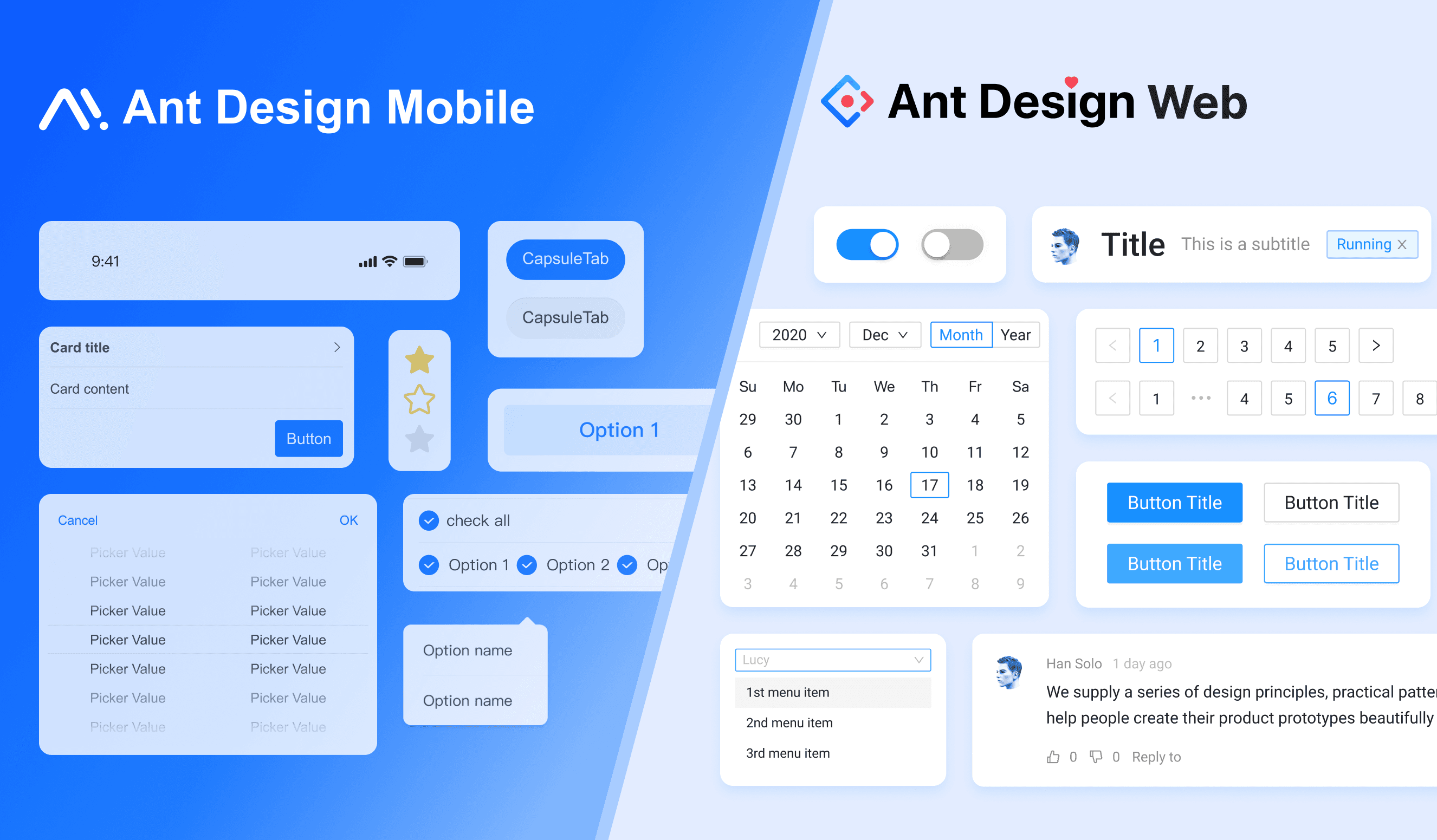
Ant Design’s web components offer over 60 UI components like buttons, forms, and tables, designed to create responsive and user-friendly interfaces. These components are flexible and easy to integrate with React.
Ant Design Mobile components are specifically designed for mobile devices, offering a clean, intuitive UI optimized for touch interactions and screen adaptability, providing a seamless mobile experience.
General
Layout
Navigation
Data Entry
Data Display
Feedback
Other
Accessibility in the Ant Design
Ant Design focuses on making its design accessible to everyone by following the WCAG (Web Content Accessibility Guidelines). The system ensures that text is easy to read by maintaining a 7:1 contrast ratio between text and background. This high contrast level is especially important for users with visual impairments, helping them easily distinguish text from its background.
In addition, neutral colors are used for text, backgrounds, and borders. Ant Design adapts these colors for both light and dark backgrounds, ensuring accessibility across different themes. The system also considers transparency when defining neutral colors, which further enhances readability and visual clarity.
Other Resources
Ant Design offers a range of additional resources to help developers and designers enhance their projects. Here are some key resources:
Ant Design Charts: Provides a comprehensive charting library for data visualization, integrated seamlessly with Ant Design components.
Ant Design Pro: A framework for building enterprise applications with pre-built templates and components, speeding up development.
AntV: A data visualization solution for developers to create interactive and visually appealing charts and graphs.
Kitchen: A Sketch toolkit for designers to create high-quality designs that align with Ant Design’s system.
Ant Design Mobile: A library of mobile UI components for building responsive mobile applications.
Ant Design Landing: A tool for building landing pages quickly and efficiently using Ant Design components.
UmiJS: A powerful framework for building React applications, with features like routing, state management, and more.
Dumi: A documentation generator that helps you create professional-looking documentation for React components.
Ant Motion: A library for creating animations and motion effects that integrate seamlessly with Ant Design components.
Community: Read updates and articles on their official GitHub and Medium page.