What is Tooltip
A tooltip is a small pop-up box that gives extra information when you hover over or focus on something on the screen. Think of it as a helpful hint that appears just when you need it. Its main purpose is to make things easier to understand without cluttering the screen. By showing extra details only when needed, tooltips keep the design clean and help users have a smoother experience.
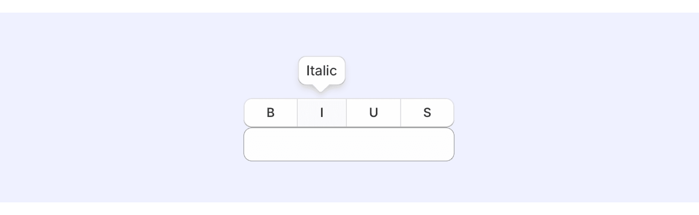
Anatomy Tooltip
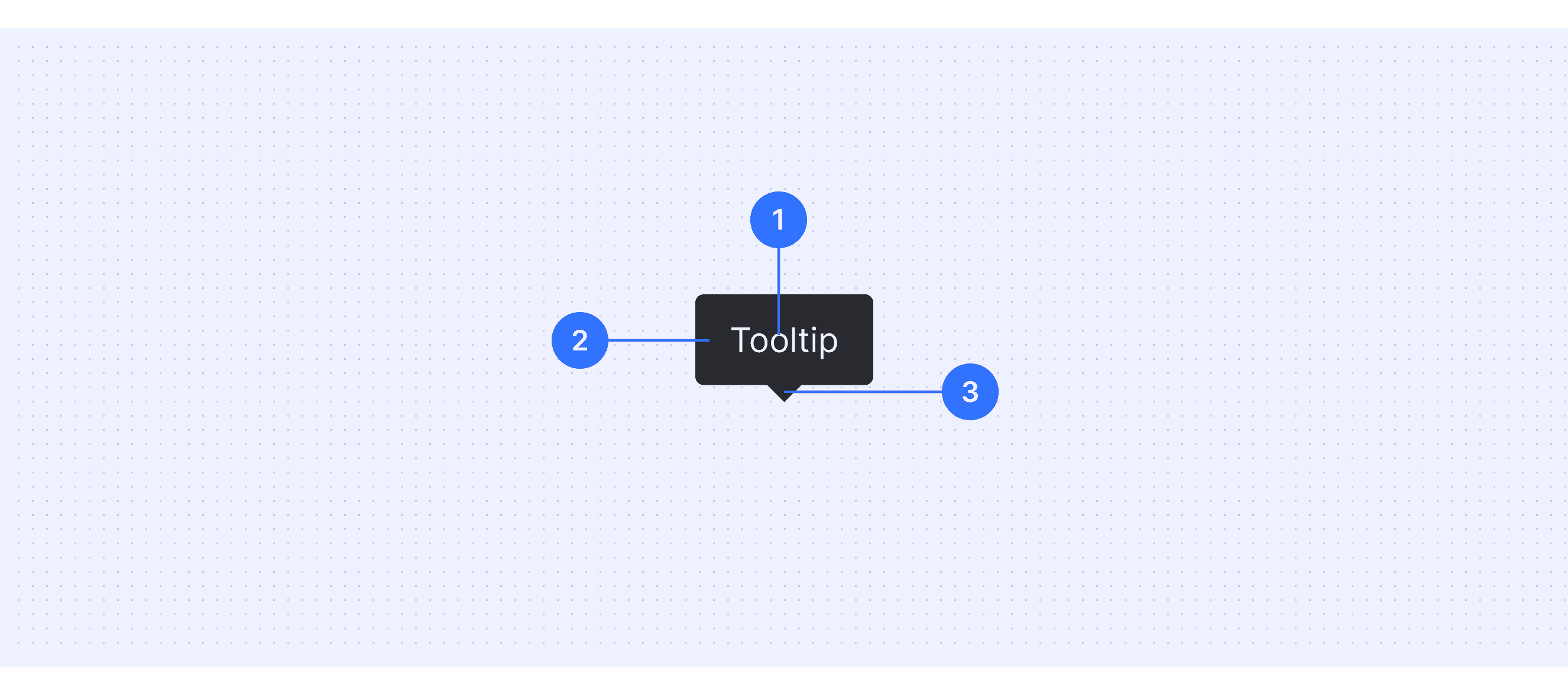
Text label: The information inside the container that gives more context or details about the element.
Container: The main part of the tooltip, usually a rounded rectangle that holds the content.
Arrow(optional): A pointer that can be added to show the tooltip's connection to the element it describes.
Core features
Immediacy: Appears instantly when the mouse hovers over or focus moves to an element.
Temporariness: Disappears automatically when the user moves away from the triggering element.
Non-intrusiveness: Does not disrupt the user's main task.
Information supplementation: Offers brief but useful additional information.
Context-relevance: Displays content that is directly related to the triggering element.
Comparison of Usage in Popular Design Systems
Let’s explore how popular design systems define and use tooltips. Learn how tooltips are implemented in systems like Material Design, Atlassian Design, and Ant Design. Compare their features and interaction guidelines, such as position and response time, to find the best option for your project.
Default Styles
Here’s a quick look at how tooltips typically appear in different design systems, focusing on their visual style.


Features Comparison in Design Systems
Comparing tooltips in Material, Atlassian, Fluent, Ant, and Polaris design systems shows different ways to improve user interfaces. These systems all use hover activation but differ in positioning and timing. Default positions vary, and response times range from 0.1 to 1.5 seconds. They offer 4 to 12 positioning options to meet different layout needs.
Design System
Defines
Position
Response time
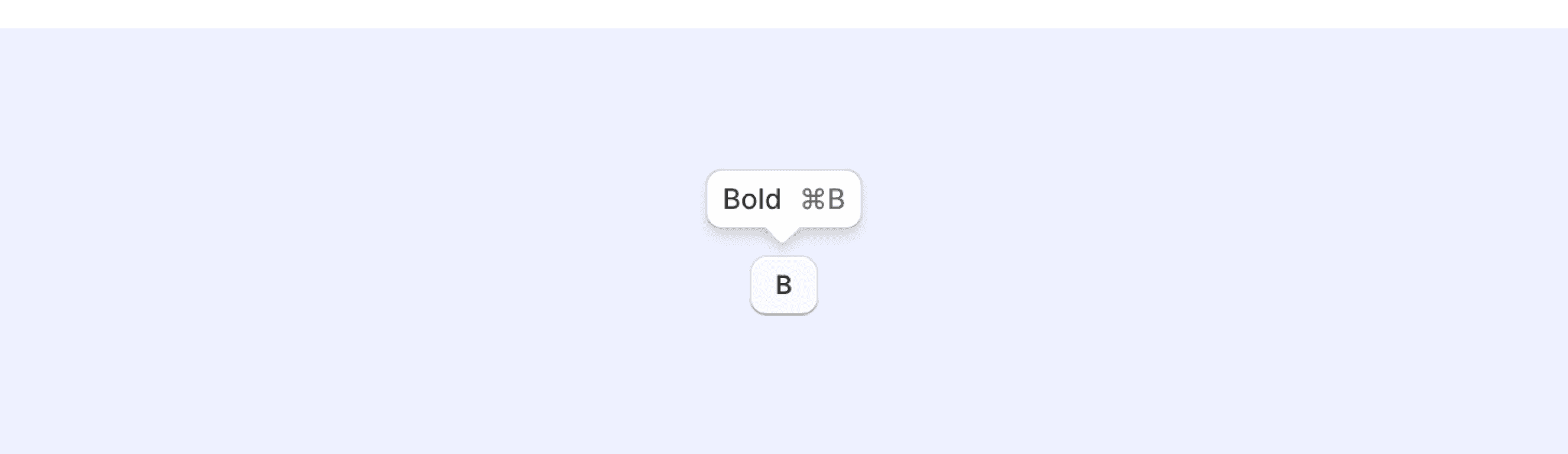
"Tooltips are text labels that appear when the user hovers over, focuses on, or touches an element.”
- Default positioning is above
- If the element is in a top app bar, the plain tooltip appears below the element at the same distances.
“Display the tooltip for 1.5 seconds. If the user takes another action before that time ends, the tooltip will disappear.”
“A tooltip is a floating, non-actionable label used to explain a user interface element or feature.”
- Use the position prop to set a preferred position (auto, top, right, left, or bottom).
- If set to mouse, the tooltip will display next to the mouse pointer.
“Time in milliseconds to wait before showing and hiding the tooltip. Defaults to 300.”
"A tooltip provides supplemental, contextual information elevated near its target component.”
- Default positioning is above
- Supports 12 different display positions
“Delay before the tooltip is shown or hidden, in 250 milliseconds.”
“Simple text popup box.”
- Default positioning is top
- Supports 12 placement options
“Delay in 0.1 seconds, before tooltip is shown/hidden on mouse enter”
“Tooltips are floating labels that briefly explain the function of a user interface element. They can be triggered when merchants hover, focus, tap, or click.”
- Defaults to above.
- Supports 4 options: above | below | mostSpace | cover
“Delay in milliseconds while hovering over an element before the tooltip is visible.”
Special Types
Material Design supports “rich tooltip”.
Rich tooltips provide additional context about a UI element. They can optionally contain a subhead, buttons, and hyperlinks.
Rich tooltips are best used for longer text like definitions or explanations.
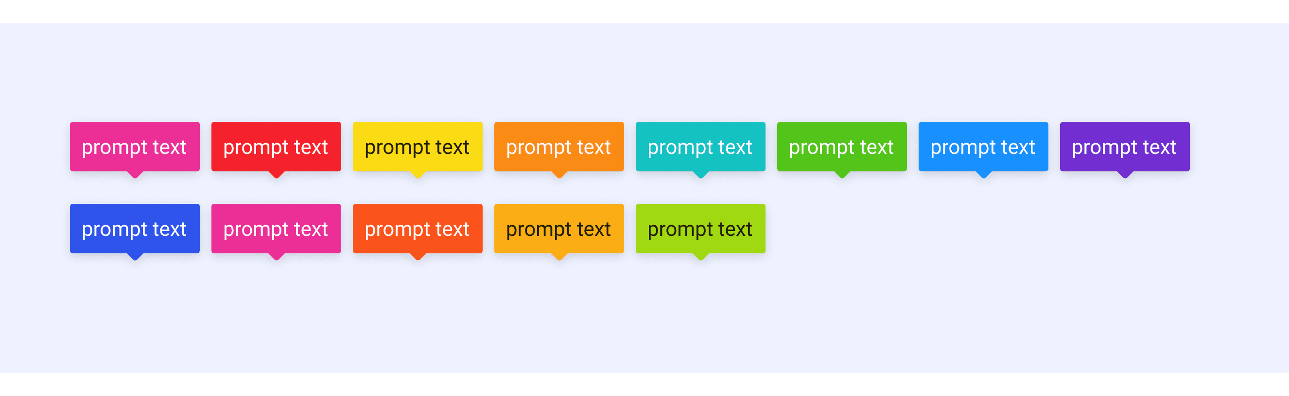
Ant Design supports colorful Tooltip styles.
Preset a series of colorful Tooltip styles for use in different situations.
Polaris Design supports “Visible only with child interaction” and “With suffix”.
Visible only with child interaction: Use when the tooltip overlays interactive elements when active, for example a form input. The dismissOnMouseOut prop prevents the tooltip from remaining active when mouse hover or focus leaves its children and enters the tooltip's content.
With suffix: Use when merchants benefit from information supplemental to the tooltip content. For example, to present a keyboard shortcut beside the content of a tooltip that describes an icon button.
Tooltip Template for Motiff
This UIkit file brings together tooltip components from Material Design, Atlassian Design System, and Ant Design. Explore the file to discover different design system components and select the ones that fit your needs. Enjoy the unique aesthetics and functionality of each design style, all in one convenient toolkit.
Tooltip vs. Popover: Difference and When to Use
Tooltips and Popovers are both tools used to give extra information in a user interface. While they might seem similar, they have clear differences in how they work, when to use them, and how they look.
When deciding between a Tooltip and a Popover, you can explore these key differences, which are summarized from Stack Overflow discussion
Accessibility in Different Design Systems
Common Practices
Tooltips are small pop-ups that show helpful information when you hover or focus on something. To make sure everyone, including people with disabilities, can use them easily, here are some key things to keep in mind:
Add Descriptions for Screen Readers: Use tools like aria-label or aria-describedby so people using screen readers can hear what’s in the tooltip.
Keyboard-Friendly: Let users open and close tooltips using their keyboard, not just a mouse.
Keep Focus in the Right Place: When a tooltip appears, the focus should stay on the button or icon that triggered it, not jump to the tooltip itself.
Make Text Easy to See: Use colors that have enough contrast between the text and the background so everyone can read it clearly.
Avoid Accidental Closures: Add a small delay before hiding the tooltip to prevent it from disappearing too quickly if someone moves their mouse.
Differences Practices
Different design systems handle tooltips in slightly unique ways. Let’s take a look:
Material Design Sysytem: They add features like transparency and timing delays to help users with low vision. This makes tooltips easier to notice and read.
Atlassian Design System: They focus on making tooltips easy to use with keyboards and screen readers. This way, everyone can access the information, no matter how they interact with the page.
Fluent Design System: Their main goal is to make the text in tooltips super clear and readable. They also make sure tooltips work well on all kinds of devices, from phones to big screens.
Ant Design System: They use special labels (like ARIA labels) to make tooltips work better with screen readers. This is especially helpful for users in different countries and languages.
By focusing on these practices, tooltips can become a simple and helpful tool for everyone, no matter how they interact with the web.
Code Examples
Explore default tooltip implementations in Atlassian, Fluent, Ant, and Polaris design systems. These code examples demonstrate the standard tooltip usage for each system. Developers can understand the basic implementation, default settings, and core features of tooltips across different design languages.


