What is Switch
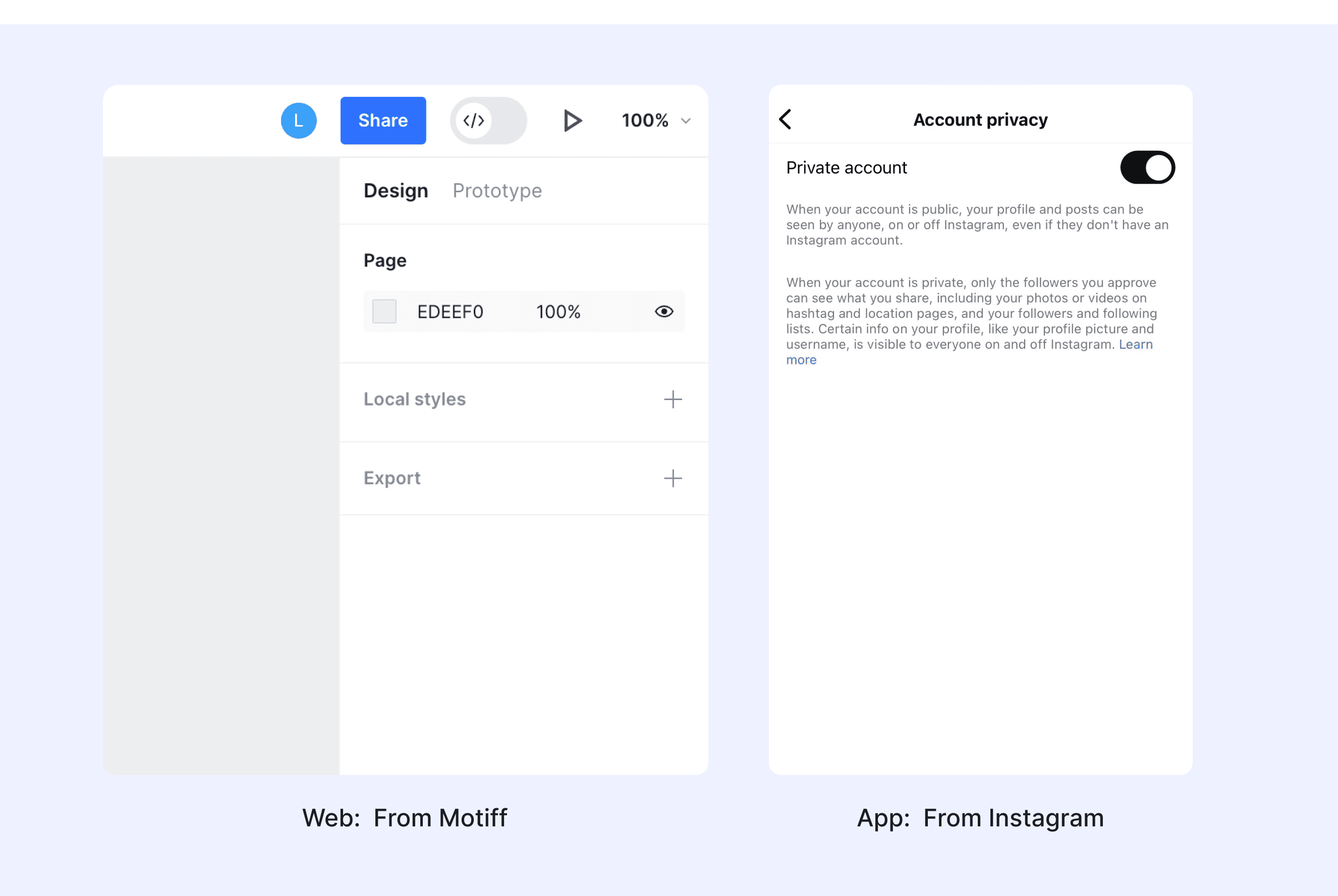
A switch is a UI component for toggling between two states, like on and off. It's used for immediate actions, unlike checkboxes that may require form submission. Switches provide instant feedback and are usually labeled for clarity, ensuring accessibility with clear visual and textual cues.
Anatomy Switch
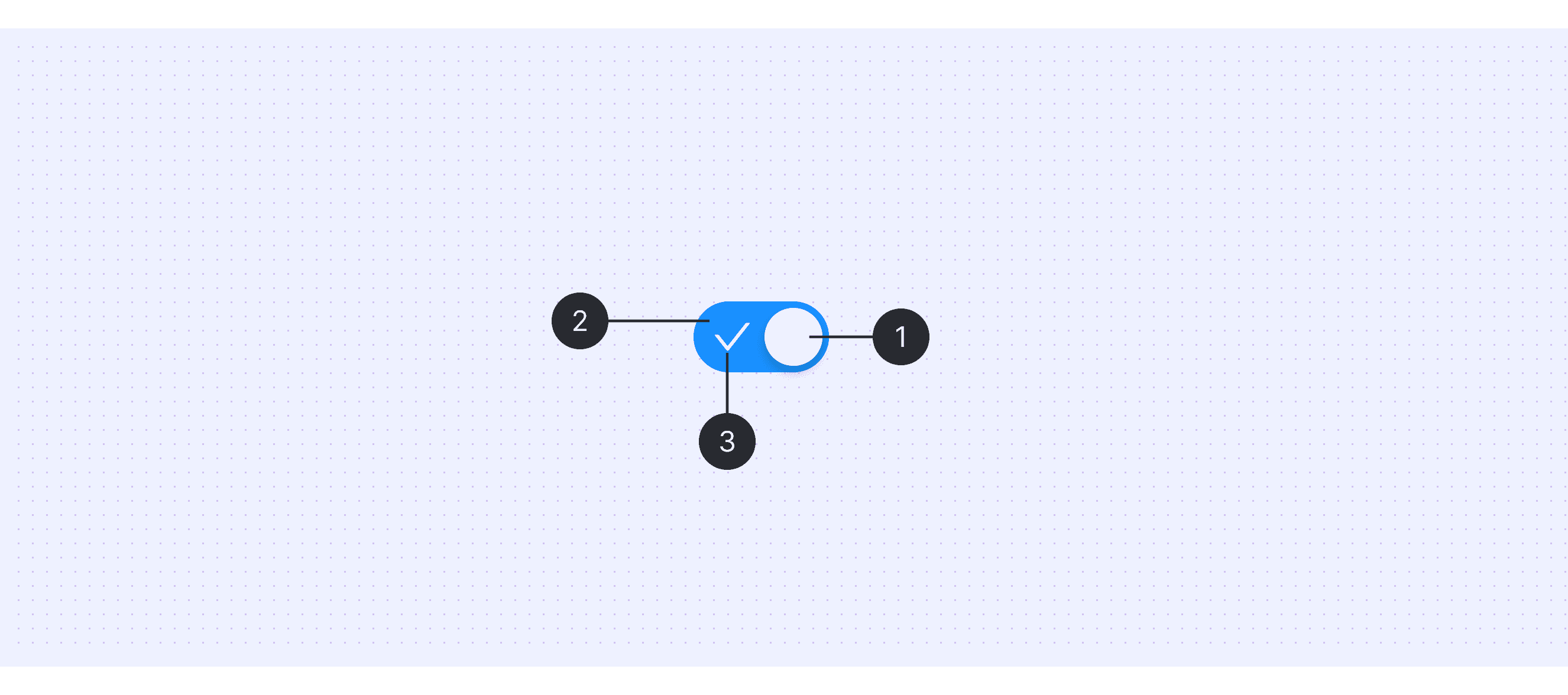
Handle: The small circular element that users drag to change the switch's state. It moves between two positions to represent the on and off states.
Track: The path in which the knob slides, often indicating the on and off positions with clear labels or color coding.
State Indicator(optional): This part often contains visual cues, such as color changes or icons, to indicate the current state of the switch (e.g., a checkmark for "on").
Core features of Switch
Immediacy: Usually displayed instantly when the mouse hovers or focus moves to an element.
Temporariness: Automatically disappears when the user's attention leaves the triggering element.
Non-intrusiveness: Does not interfere with the user's main task flow.
Information supplementation: Provides concise but valuable additional information.
Context-relevance: Content directly related to the triggering element.
Comparison of Switch Usage in Popular Design Systems
Now, let's explore how the Switch component is defined and implemented across various well-known design systems:
Discover how Switches are implemented in different design systems like Material Design, Atlassian Design, Ant Design, and others. Compare their features, interaction guidelines such as toggle behavior and visual feedback to choose the best fit for your project.
Default Switch Styles
Enumerates the default appearances of switches across various design systems, highlighting their visual characteristics and usability.


Features Comparison of Switch
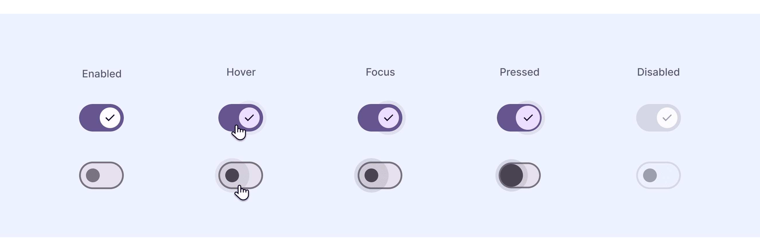
The switch components are present across various design systems such as Material Design, Atlassian, Fluent, Ant, and others. However, in some design systems, they are not classified separately but are instead discussed under the broader category of toggles. These switch components share common features, such as providing binary on/off control with immediate visual feedback to enhance user experience. Switch components are typically designed with accessibility in mind, ensuring clear state indication through visual cues and supporting states like enabled, disabled, and focused. Despite these similarities, they differ in their approach to customization, state diversity, and implementation details.
Design System
Defines
Interaction Feedback
“Switches toggle the selection of an item on or off.”
Smooth animations for state transitions
“A toggle is used to view or switch between enabled or disabled states.”
Immediate visual feedback
“Toggles represent a physical switch that allows users to turn things on or off. Use Toggles to present users with two mutually exclusive options (like on/off), where choosing an option results in an immediate action.”
Visual feedback with focus indicators
“A toggle lets people choose between a pair of opposing states, like on and off, using a different appearance to indicate each state.”
Subtle animations and haptic feedback (if available)
“A toggle is used to quickly switch between two possible states. They are commonly used for “on/off” switches.”
Visual and tactile feedback
Special Types of Switch
Material Design supports “ripple reaction”.
The ripple effect in Material Design's Switch component provides visual feedback to users when they interact with the switch. This effect is especially important on touch devices, where the ripple helps indicate that the interaction has been registered, as the user's finger might partially cover the switch during the interaction.
Ant Design supports “loading state”.
Mark a pending state of switch.

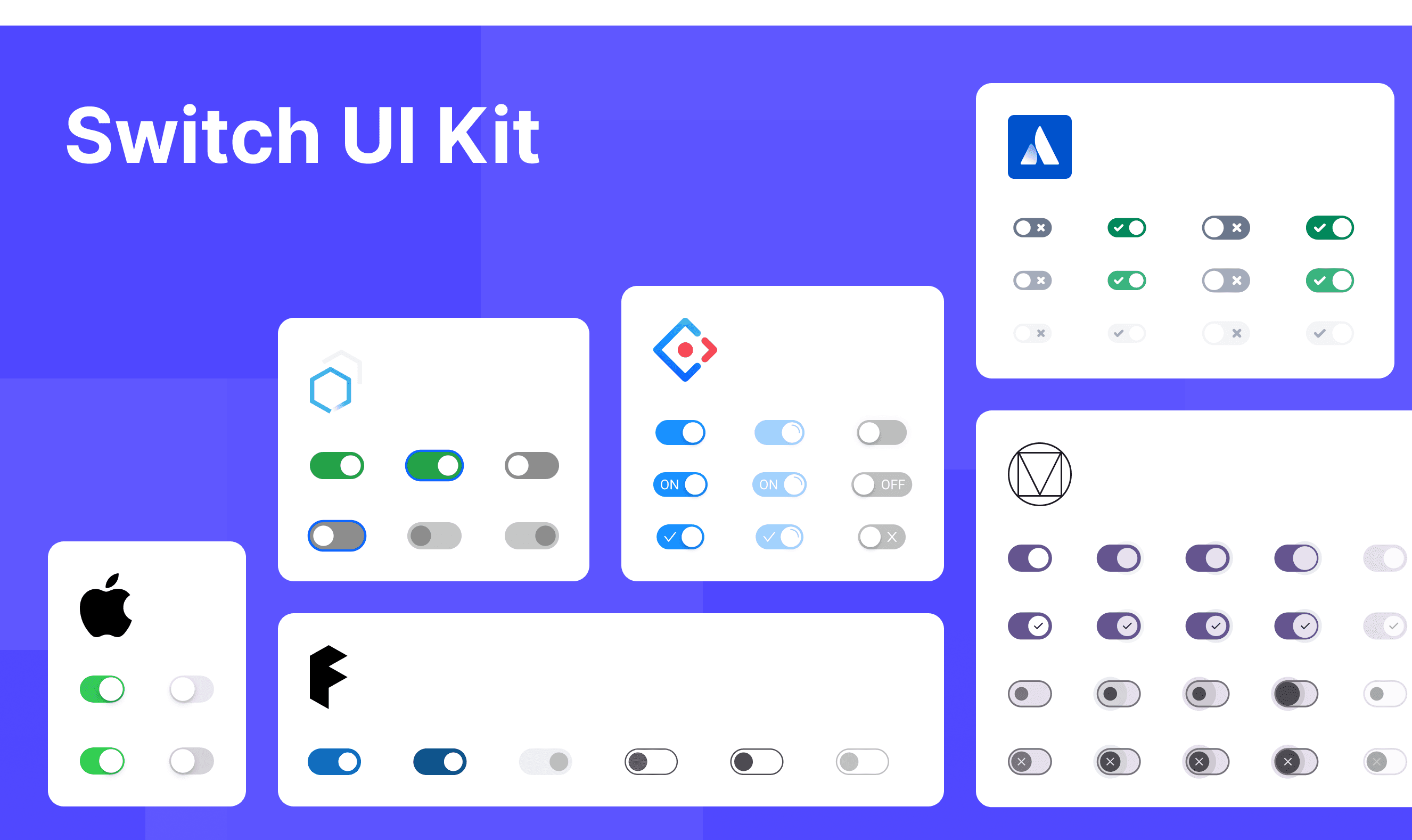
Switch Template for Motiff
This UIkit file combines switch components from Material Design, Atlassian Design System, and Ant Design. Upon opening, you'll find various switch styles, usage methods, and customization options. We've integrated the best of these renowned design systems to offer diverse switch solutions for your projects. Browse the file to explore different design system components and choose the ones that best suit your needs. Experience the unique aesthetics and functionality of each design style, all conveniently gathered in one comprehensive toolkit.
Switch vs. Checkbox: Which One Will Power Up Your UI?
Switches and Checkboxes are fundamental user interface components that help users make binary choices. While they might seem similar, they serve different purposes, have distinct use cases, and should be applied thoughtfully to create an intuitive and effective user experience.
When deciding between a Switch and a Checkbox, consider the following key differences adapted from Toggle-Switch Guidelines:
Purpose of Interaction:
Switches are best suited for toggling system functionalities or settings on and off. They provide immediate feedback and are often used when an instant change is expected without further confirmation.
Checkboxes, on the other hand, are ideal for selecting one or more options from a list. They often require a submission action (like a "Save" button) to apply the selected changes.
Feedback Timing:
Switches deliver immediate results, reflecting the change as soon as the switch is toggled. This aligns with real-world switches, such as turning a light on or off.
Checkboxes are typically used in forms where the user can select multiple options before submitting the form, making the changes effective.
Visual Design and Interaction:
Switches visually represent a state change with a sliding mechanism and often include a color change to indicate "on" or "off" status.
Checkboxes are square boxes that display a checkmark when selected. They are usually used when users need to select multiple options independently.
Switch Accessibility in Different Design Systems
Common Practices
Switch components across various design systems typically share the following key characteristics:
Binary State Control: Switches are used to toggle between two states, usually "On" and "Off" , representing an immediate change in system settings or functionality.
Visual Feedback: They provide immediate visual feedback when toggled, often changing color or position to indicate the current state.
Accessibility: Ensuring switches are accessible, with considerations for screen readers, keyboard navigation, and color contrast.
Customization Options: Many design systems offer customization for size, color, and labels, allowing the switch to fit seamlessly into various interfaces.
Differences Practices
Material Design (Google): Uses the ripple effect for tactile feedback on touch devices, with immediate state changes and clear visual indicators.
Atlassian Design System: Emphasizes stateless toggles that provide flexibility in implementation, ensuring consistency across different products.
Microsoft Fluent Design System: Offers variations in size and layout, with a focus on accessibility and visual clarity across devices.
Ant Design: Includes a "Loading" state to indicate when a process is pending, enhancing user experience by clearly communicating action status.
Apple Human Interface Guidelines: Stresses simplicity and clarity, with switches designed to be intuitive and easily recognizable in iOS applications.
Carbon Design System (IBM): Focuses on integrating toggles with content and layout considerations, ensuring they are used appropriately within the context.
Code Examples
Discover the default switch implementations in Atlassian, Fluent and Ant design systems. These code examples illustrate how each system approaches switch components, offering developers clear guidance on implementation, default behaviors, and essential features. Developer's can gain a comprehensive understanding of how different design systems manage on/off states, customization, and accessibility through these practical, real-world examples.、
Atlassian Design System

Ant Design System
